


Podręcznik użytkownika
Dokument

Karta dokumentu umożliwia zmianę ustawień dokumentu dla każnego utworu, takie jak tryb słabego oświetlenia, kolor odcienia, czcionka, rozmiar papieru i marginesy.
Ustawienia
Możesz nacisnąć ikonę klucza w górnym lewym rogu, aby zmienić globalne ustawienia systemowe dotyczące zachowania tego menu. Nie wpływa to na formatowanie poszczególnych utworów.
Tryb odcienia
Tryb określa kolory używane do wyświetlania utworu na ekranie i może być używany do poprawy widoczności ekranu w różnych środowiskach lub dla użytkowników z zaburzeniami stresu wizualnego. Tryby zmieniają się odpowiednio dla Trybu słabego oświetlenia. Jeśli żadna opcja nie jest wybrana, OnSong wyświetli utwór przy użyciu ustawień domyślnych. Opcje obejmują:
- Papier wyświetla utwór w wysokim kontraście czarno-białym.
- Przyciemniony wyświetla podobnie do papieru, ale z niższym kontrastem.
- Sepia wyświetla podobnie do przyciemnionego, ale z cieplejszymi tonami kolorów.
- Niebo wyświetla utwór poprzez nałożenie niebieskiego odcienia, aby pomóc w zaburzeniach stresu wizualnego.
Tryb słabego oświetlenia
Po prawej stronie przycisków trybu znajduje się ikona, którą możesz użyć do przełączenia trybu słabego oświetlenia. Ta funkcja jest ustawiana systemowo po przełączeniu i zauważysz, że stosuje te zmiany również do wybranego trybu. Wpływa to na wszystkie utwory i menu w OnSong.
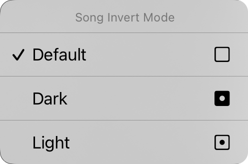
Możesz także nacisnąć i przytrzymać przycisk słabego oświetlenia, aby wyświetlić menu kontekstowe Trybu inwersji utworu. Stąd możesz zmienić tryb słabego oświetlenia dla określonego dokumentu. Domyślnie jest to ustawione na „domyślne", co oznacza, że dokument utworu będzie uczestniczyć w trybie słabego oświetlenia w miarę zmian w systemie. Możesz tutaj wymusić wyświetlanie dokumentu utworu w trybie ciemnym lub jasnym, niezależnie od trybu słabego oświetlenia ustawionego dla aplikacji.
Rodzina czcionek
Pięć przycisków na górze menu pozwala wybrać czcionkę całego utworu. Możesz wybrać spośród:
- Bezszeryfowa to czcionka taka jak Helvetica, która jest idealna do wyświetlania schematów akordów. Domyślna.
- Szeryfowa to czcionka taka jak Georgia, która może być łatwiejsza do czytania dla niektórych użytkowników.
- Pisany to czcionka taka jak Marker, która jest bardzo wąska, pozwalając na zmieszczenie więcej treści na stronie.
- Monospaced to czcionka o stałej szerokości, taka jak Courier, która jest przydatna w niektórych przypadkach do wyrównywania akordów.
- Niestandardowa wyświetla wielokropek, w którym możesz przeglądać czcionki zainstalowane na urządzeniu i wybrać jedną. Za każdym razem, gdy wybierzesz tę opcję, ekran Niestandardowa czcionka pojawi się ponownie do wyboru.
Odstęp między wierszami
Jeśli chcesz zmieścić więcej na ekranie, rozważ zmniejszenie odstępu między wierszami lub przestrzeni między wierszami. Możesz również zwiększyć odstęp między wierszami, aby uzyskać więcej miejsca między wierszami dla lepszej widoczności. Możesz nacisnąć ikony po lewej i prawej stronie wszystkich suwaków, aby dokładnie dostosować każdą wartość. Dostosowuje się między 0,7 a 1,3 linii. Domyślnie wynosi 1,0.
Papier
To pozwala ustawić rozmiar wirtualnej strony, co wpływa na rozmiar wybieranych czcionek. Na przykład większe rozmiary papieru będą wyświetlać czcionki w mniejszym rozmiarze. Ikony po prawej stronie pozwalają wybrać między orientacją portretową i krajobrazową.
Układ
Sekcja układ pozwala zdefiniować sposób, w jaki każda strona dokumentu jest wyświetlana, gdy używasz Aparatu renderowania R2. Ma trzy kontrolki:
Paginacja
To pozwala wybrać przepływ schematu w dół strony z ciągłym arkuszem przewijającym lub podzielić stronę na wirtualne arkusze papieru.
Kolumny
Ten formant pozwala wybrać między jedną a dwiema kolumnami. Gdy dwie kolumny są włączone, sekcje twojego utworu są przepływane do drugiej połowy arkusza.
Marginesy wewnętrzne
To jest szerokość marż, przestrzeni między kolumnami. Opcje obejmują 0" do 1" w przyrostach 1/16".
Marginesy
Marginesy pozwalają dodać wstawkę na krawędziach wirtualnego papieru na ekranie. Jest to przydatne do wyświetlania tekstu i zapewnienia miejsca dla Gorących rogów lub Stref nawigacji podczas korzystania również z zaznaczania sekcji. Ikona po prawej stronie pokazuje, kiedy margines jest zmieniony: lewy, prawy, górny lub dolny.
Stopka
To pozwala ustawić rozmiar stopy jako procent rozmiaru czcionki tekstów piosenek. Możesz również użyć przycisku po prawej stronie, aby przełączyć stopkę włączoną i wyłączoną.
Wszystkie formanty na tej karcie z wyjątkiem trybu słabego oświetlenia dotyczą wybranego utworu. Wkrótce zobaczymy, jak zastosować nasze zmiany do różnych utworów w naszej bibliotece.
Możesz zmienić wartości domyślne każdego aspektu dokumentu, naciskając ikonę klucza w górnym lewym rogu, aby uzyskać dostęp do opcji Preferencje stylu dokumentu.


